When Colour Expires: The Quiet System Behind What We Throw Away
Where perception,pressure, and pollution meet in a single shade
By Kegomoditswe Mosime Published: 06 August 2026
One of the hardest questions I’ve ever been asked wasn’t academic, political, or even philosophical.
It was on a date. The question?
“What’s your favourite colour?”
I hesitated. Not because I dislike colour, but because I’ve never understood how something so inherently unstable becomes something we’re expected to treat as an identity.
Colour shifts with light. It changes with distance. It changes with context.
The Science of Colour
What Is Colour? The Physics Behind It
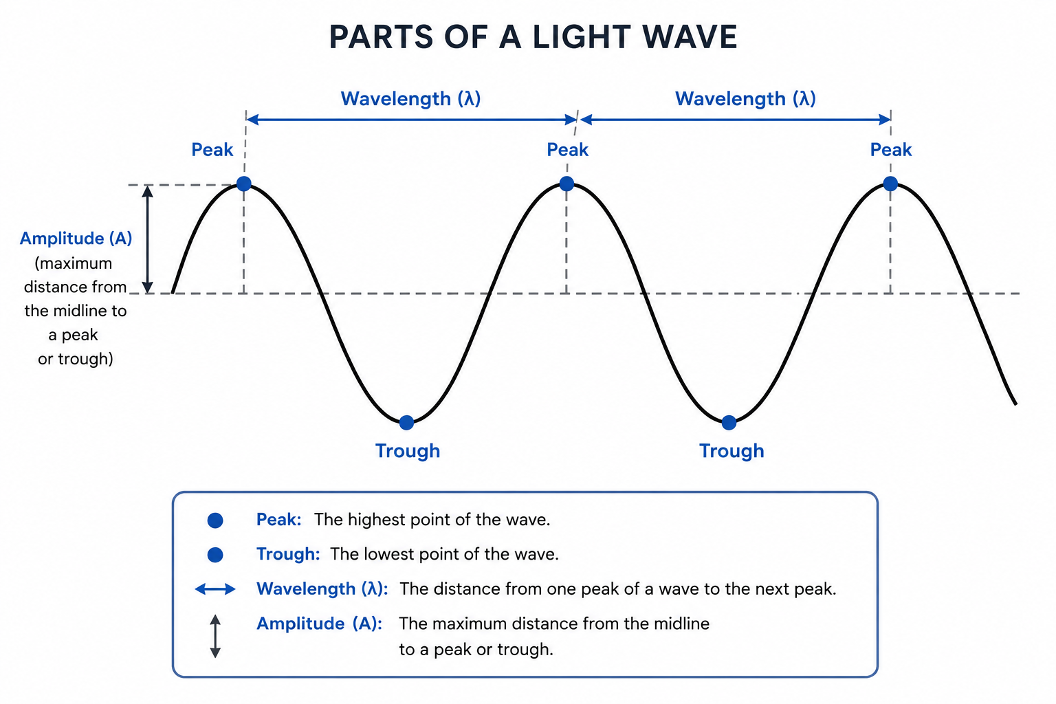
When we talk about colour, we first need to understand the physics behind what colour actually is. In physics, colour is determined by the wavelength of visible light. A wavelength is a measurable property of light that helps distinguish one colour from another.
Light travels in waves. Like waves on the surface of water, light waves have repeating high points (peaks) and low points (troughs). A wavelength is the distance between two matching points on the same wave, such as from one peak to the next. Because light exists in different wavelengths, different wavelengths are perceived as different colours.
When light reaches an object, those wavelengths do not behave in the same way. Take a leaf, for instance. When light shines on a leaf, the leaf absorbs some wavelengths and reflects others. The reflected wavelengths travel away from the leaf and eventually enter our eyes.
The reflected light enters through the cornea and lens before reaching the retina. Inside the retina are specialised cells called cones that detect this reflected light.
The cones convert the light into electrical signals, which are sent to the brain for processing. The brain interprets these signals and creates the experience we call colour. This process can be seen in something as ordinary as a leaf. When the brain processes the signals generated by the wavelengths reflected by a leaf, we perceive the leaf as green. The green is not stored inside the leaf itself; it emerges from the interaction between light, the eye, and the brain.
How Colour Becomes Meaning
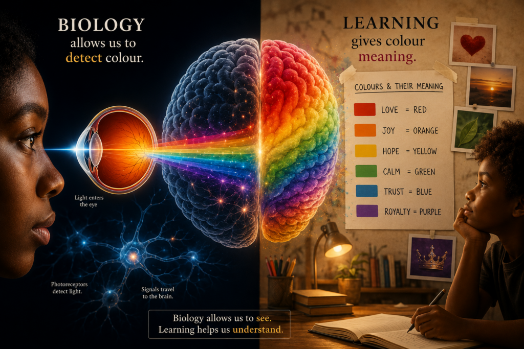
The ability to distinguish between different wavelengths of light is part of our biology. Understanding that one range of wavelengths is called blue and another is called green, however, is something we learn. Colour is not only a visual experience; it is also a learned system of categories and language.
From infancy, we gradually acquire the language of colour through our parents, caregivers, teachers, and books. As colour names are repeated throughout our lives, they become more than arbitrary labels. We no longer hear “blue” or “green” as words we once memorised. We now instantly associate each name with a specific colour. Psychologists call this categorical perception: rather than seeing colour as one continuous spectrum, we naturally group it into categories such as blue, green, red, and yellow. These categories make the visual world easier to understand and navigate.
Language does more than help us name colours. According to the Sapir-Whorf hypothesis of linguistic relativity, the language we speak may influence how we perceive and interpret colours. Although the light reaching our eyes remains the same, the words we learn can shape how easily we notice, remember, and describe differences between colours. For example, English has a single word for turquoise, while Setswana typically describes this colour using combinations of words, such as botala jwa loapi(“sky-blue”) or simply botala, depending on the context. The colour itself has not changed. Only the language used to describe it has.
The Psychology of Colour
Our relationship with colour continues to evolve long after we learn the names we give it. As we grow older, fashion, advertising, design, film, television, and social media continue to redefine what colours come to represent, influencing which colours feel modern, luxurious, calming, energetic, or nostalgic. With each repeated encounter, these associations grow stronger and more familiar.
This growing sense of familiarity is known in psychology as themere exposure effect: our tendency to develop a preference for things simply because we encounter them often. Over time, repeated exposure does more than make the colours we recognise feel familiar. That growing familiarity influences the colours we trust, the colours we are drawn to, and ultimately, the colours we prefer.
Our relationship with colour, then, is moulded by far more than biology alone. What begins as wavelengths of light gradually becomes a system of learned meanings and preferences, built through language, repetition, memory, and culture.
Those preferences, however, do not remain personal forever.They become part of a much larger system.
When Colour Became a Schedule
How Does a Colour Acquire a Deadline?
A “colour of the season” is not a passive observation; it is a deadline dressed as a trend, quietly suggesting that a shade has an arrival time, a window of relevance, and an expiry date.
There is a scene in The Devil Wears Prada, famously known as the cerulean monologue, that makes this system visible. In the scene, Miranda Priestly dismantles the notion that a plain blue sweater was ever a neutral, individual choice. The sweater isn’t simply blue; she points out it is cerulean, a shade with its own name, its own paper trail. She traces that exact hue back through a chain of decisions that the wearer never witnessed: it surfaces first in one designer’s gown collection, then in another designer’s jacket collection, spreading across a season’s worth of runways before finally descending through department stores into the clearance bin where it was “found”.
This scene is often remembered as fashion trivia. But it is better understood as an insight into how colour trends take shape and how choices that feel deeply personal often begin long before we make them.
Once colour acquired a deadline, everything carrying it quietlyinherited one too.
Long before a colour appears in a shop window or on a clothing rack, researchers, designers, and trend forecasters spend months, sometimes years, studying the world around them. They analyse shifts in culture, consumer behaviour, design, technology, art, economics, and global events to identify the colours most likely to resonate in the seasons ahead.
Organisations such as the Pantone Color Institute, WGSN, and Intercolor contribute to this process in different ways. The Pantone Color Institute develops internationally recognised colour standards and publishes influential seasonal palettes. WGSN draws on consumer, cultural, and market research to forecast emerging trends. Intercolor brings together colour specialists from around the world to exchange research and develop long-term colour directions.
Once these forecasts are released, the colours begin moving through the fashion industry. Designers build collections around them. Retailers place orders months in advance. Advertising campaigns, magazine editorials, shop windows, and social media gradually repeat the same palette until it begins to feel familiar, current, and eventually inevitable.
Millennial Pink is one well-known example. What began as a colour appearing across fashion, beauty, interiors, and branding gradually became so widespread that it came to define an era.
With every new palette, the colours change,quietly encouraging us to see the same garments a little differently.
When Preference Becomes a Purchase
The Colour We Buy
To see how this system unfolds in everyday life, imagine the following scenario.
A new season arrives. This season’s key colour is Pantone Brilliant White, and the crew-neck T-shirt is its hero piece. The crew-neck T-shirt in Brilliant White appears everywhere: displayed in shop windows, featured in advertisements and fashion editorials, and across social media, where influencers style it in outfit videos, “Outfit of the Day” posts, and “Get Ready With Me” reels.
As the crew-neck T-shirt becomes impossible to ignore, it begins to feel less like just another white crew-neck T-shirt and more like the season’s must-have piece. Eventually, buying one feels almost inevitable. Before you know it, you’ve bought one.
At first glance, it doesn’t seem very different from the one you already own. Yet something about it feels newer. More current. More on trend.
When you get home, you hang it beside last season’s white crew-neck T-shirt. Only then do you realise how similar they really are. Both are plain white. Both still fit. Both are in good condition. The older one hasn’t worn out. It has simply fallen out of season, even though nothing about the T-shirt has changed. What has changed is the meaning attached to its colour.
You decide to donate last season’s white crew-neck T-shirt. It seems like the responsible choice because donating it makes room in your wardrobe while giving the garment a second chance.
For you, the story ends at the donation bag. For the T-shirt, the journey is only just beginning.
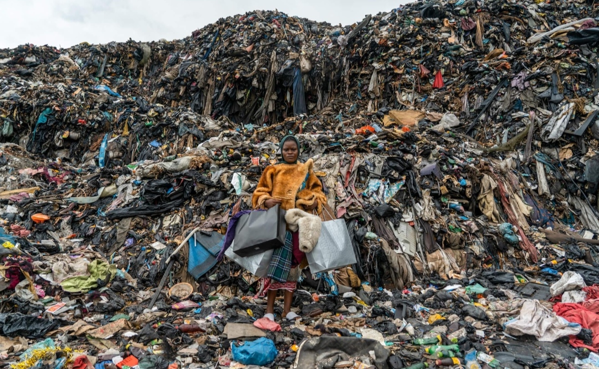
Did You Know? Around 15 million second-hand garments arrive at Ghana’s Kantamanto Market every week. Yet estimates suggest that roughly 40% of the clothing entering the market ultimately becomes waste because the volume exceeds what can be repaired, resold, or reused.
Once dropped into a donation bin, the white T-shirt enters a system that most of us never see. It joins thousands of other garments collected from households, charities, and clothing drives, each carrying the same hope: that someone else will wear them.
At a sorting facility, workers assess each garment according to its condition, fibre composition, brand, and resale potential. Some garments remain in local second-hand markets, while others are compressed into large bales and prepared for export. From there, millions of garments continue their journey to second-hand markets across Africa, Asia, and Latin America in search of a new owner.
For some garments, this marks the beginning of a genuine second life. For many garments, however, the journey does not end there. Instead, it continues into markets such as Ghana’s Kantamanto Market, where enormous volumes of donated clothing arrive every week. Traders sort, repair, and resell as much as they can, but the sheer quantity means that not every garment finds a buyer. Garments left unsold often become waste, eventually making their way to informal dumping sites, waterways, and beaches.
Pearls of Knowledge; What began as a simple decision to replace one T-shirt with another has now become part of a much larger global system, one that extends far beyond our wardrobes.
When the Fabric Outlives the Fashion
A garment’s colour does not determine its environmental fate. Two garments may share the same colour and look almost identical, yet the materials used to make them determine how they break down and affect the environment.
Natural fibres such as cotton, linen, wool, and hemp behave differently from synthetic fibres such as polyester, nylon, and acrylic. Cotton is made from cellulose, a natural plant polymer that micro-organisms can break down under the right environmental conditions. Polyester, by contrast, is a plastic. It is manufactured from petroleum-derived polymers and is designed to resist biological decomposition.
Modern clothing, however, is rarely made from a single fibre. Many garments are blends, combining natural fibres like cotton with synthetic fibres such as polyester. A cotton-polyester T-shirt may feel soft and breathable, but once discarded, each fibre follows a different path. The cotton component may gradually decompose, while the polyester fibres remain behind for decades, sometimes centuries.
As sunlight, heat, moisture, and physical abrasion slowly weaken synthetic fabrics, they do not simply disappear. Instead, they fragment into increasingly smaller pieces known as microplastics, plastic particles smaller than five millimetres. During this process, tiny strands called microfibres are also released. These microscopic fibres enter soil, rivers, and oceans, where they can persist long after the garment itself has fallen apart.
Image source: The Revival of Kantamanto Market, The Climate Tribe.
Weight of Colour; The colour trend may have lasted only one season. The synthetic fibres left behind can remain in the environment for generations.
Colour, Choice, and Consequence
It all begins with something quieter and far less accusatory: colour. Colour may seem harmless, but once it becomes seasonal, it becomes one of the mechanisms that quietly drives consumption.
We often explain overconsumption using terms such as consumerism, capitalism, and textile waste. Most of us know these terms intellectually. We understand what they mean and the problems they describe. What we rarely do is connect them to the ordinary purchasing decisions that eventually produce those very outcomes.
Ask someone their favourite colour, and they’ll answer without hesitation, unguarded. That instinctive response is precisely what makes colour so influential. Colour is not the root cause of overconsumption. It is one of the ways the system steers purchasing decisions without ever announcing its intentions.
No one walks into a shop thinking, “Today I’m going to contribute to a landfill”. Instead, it’s simply “That shade of white is gorgeous”. Across millions of wardrobes, that ordinary thought becomes another purchase, another donated bag, another bale sorted at Kantamanto, and another contribution to a system struggling to cope with its own waste.
This is how the industry distances the act of buying from its consequences. It doesn’t market overconsumption. It markets this season’s palette, chosen in a forecasting studio many months before it reaches the shop floor, then filtered through collections until it feels like a personal preference rather than a commercial strategy. It doesn’t sell excess. It sells a must-have shade. People don’t respond to messages about buying things they don’t need. They respond to New Arrivals, This Season’s Colours, and Limited Editions. The language changes, but the outcome often remains the same.
That is the sleight of hand: colour gives overconsumption a vocabulary that doesn’t sound like overconsumption at all. We don’t see consumerism. We see butter yellow. We see sage green. We see cherry red. We see Brilliant White, and we call it taste.
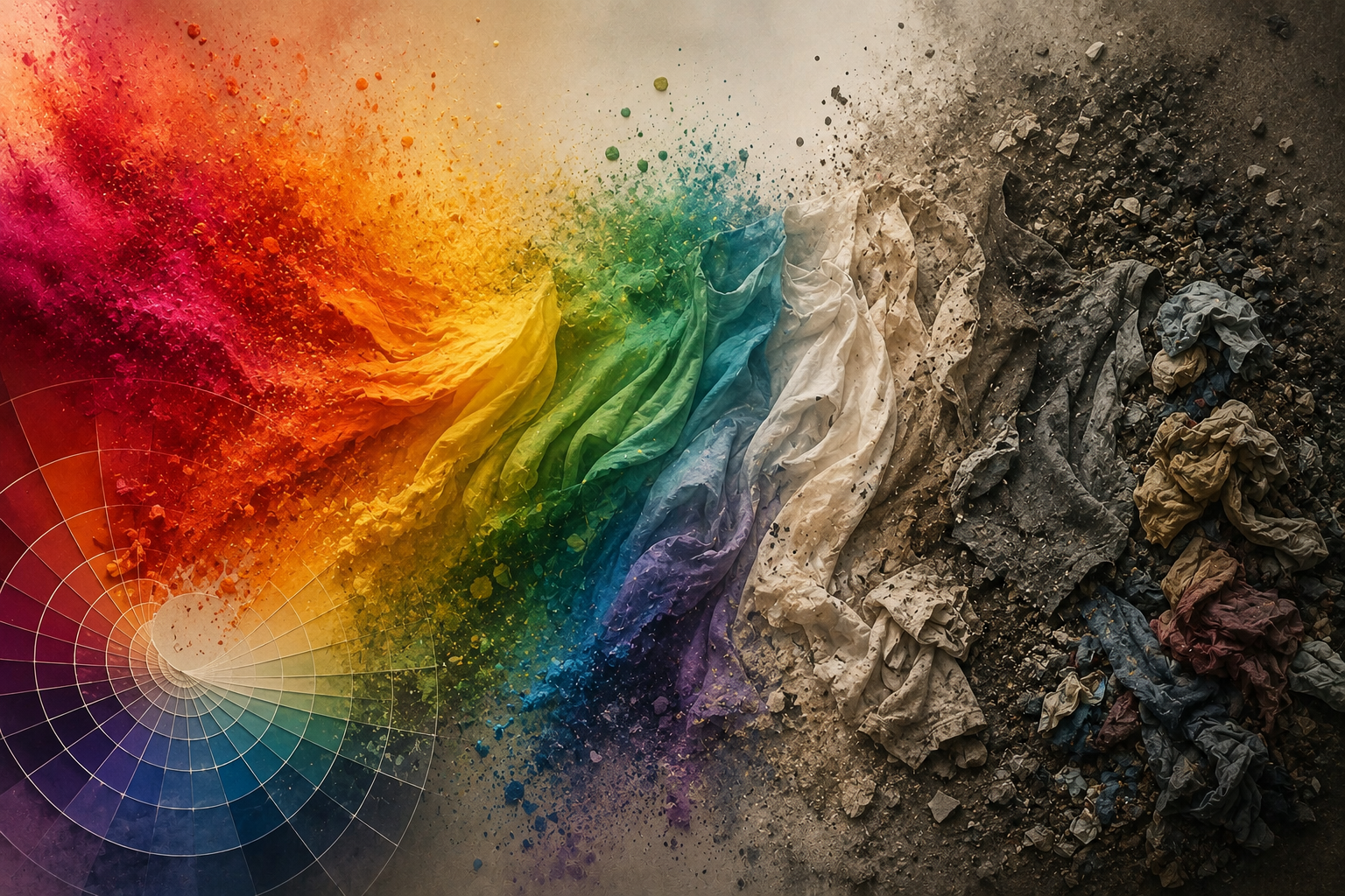
But colour was never the villain. It was simply one of the easiest tools to enlist. On its own, colour is one of life’s quieter pleasures: a leaf catching the light, a favourite colour named without thinking, the particular blue of the sky before rain. It exists to express beauty, identity, culture, and emotion. The industry didn’t need to change colour itself. It only needed to reshape our relationship with it, turning preference into purchase, seasons into deadlines, and shades into reasons to buy again.
We don’t think we’re buying pollution. We think we’re buying a colour. Perhaps that is the most powerful part of the system: not that it convinces us to consume, but that it convinces us we arrived at the decision entirely on our own.
It Is Worth Something Today
Hello, Gorgeous Beings.
Has this article changed the way you think about colour? I’d love to hear your thoughts. Share them in the comments below.
👇 The reference list comes first. Keep scrolling, and you’ll find the comments section just underneath.
REFERENCES
Berlin, B., & Kay, P. (1969).Basic color terms: Their universality and evolution. University of California Press.
Browne, M. A., Crump, P., Niven, S. J., Teuten, E., Tonkin, A., Galloway, T., & Thompson, R. (2011). Accumulation of microplastic on shorelines worldwide: Sources and sinks. Environmental Science & Technology, 45(21), 9175–9179. https://doi.org/10.1021/es201811s
Callister, W. D., & Rethwisch, D. G. (2018).Materials science and engineering: An introduction (10th ed.). John Wiley & Sons.
Halliday, D., Resnick, R., & Walker, J. (2014).Fundamentals of physics (10th ed.). John Wiley & Sons.
Persson, A., & Ekström, M. (2011).Color forecasting: A study of the color forecasting process in the fashion industry [Master’s thesis, Lund University]. Lund University Publications. https://lup.lub.lu.se/student-papers/search/record/1979656
The Or Foundation. (2022). Comment on the Report on Microfiber Pollution – 2022 (Report to Congress) (NOAA Docket No. NOAA-NOS-2022-0061-0009). National Oceanic and Atmospheric Administration. https://theor.org/
Wandell, B. A. (1995).Foundations of vision. Sinauer Associates.
Zajonc, R. B. (1968). Attitudinal effects of mere exposure. Journal of Personality and Social Psychology, 9(2p2), 1–27. https://doi.org/10.1037/h0025848
Leave a Reply